Blog12 December 2023

Data visualisation style guide (pdf)
Why has TASO developed a data visualisation style guide?
At TASO, we believe the power of impactful data visualisation is often overlooked, and there’s immense value in telling stories with data. Audiences are increasingly flooded with information, and presenting data in a compelling way is crucial to increasing engagement with data analysis.
This guide is TASO’s contribution to highlighting the importance of data visualisation and making it more accessible. It is a tool for those who see the storytelling potential in data, offering guidance to enhance the impact of your information.
In developing the guide, we have drawn extensively on existing data visualisation work, notably the key principles outlined by Jonathan Schwabish. Our focus was on distilling and accentuating elements from various sources, including Schwabish’s insights, that we thought would be most beneficial for TASO and the wider sector.
This guide, therefore, stands as a curated synthesis, offering tailored and impactful guidance for our specific context, with due credit to the influential work that inspired it. In fact, we believe the further resources section to be one of the most valuable parts of the guide. There is a big world of incredible data visualisations out there, and we encourage you to go out and explore it.
What does applying the style guide look like?
To see how using the style guide works in practice, we can look at how a chart evolves as the principles from the guide are applied.
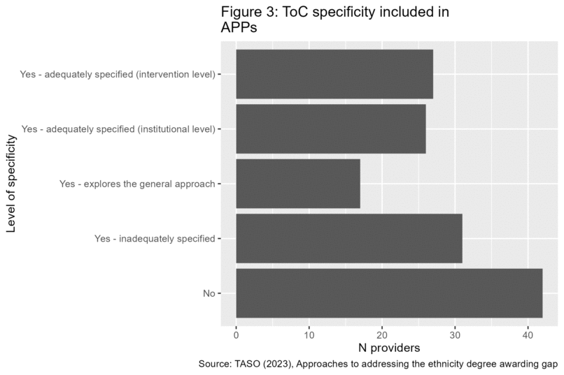
To do this, let’s start by creating a chart using data from TASO’s report on addressing the ethnicity degree awarding gap. One finding in this report was that after reviewing Access and Participation Plans from different higher education providers, over 40 did not have a Theory of Change (ToC).
Step 1: Basic chart
A chart to show this in its most basic form might look something like this, using many of the default settings in the ggplot library of the popular statistical programming language R:
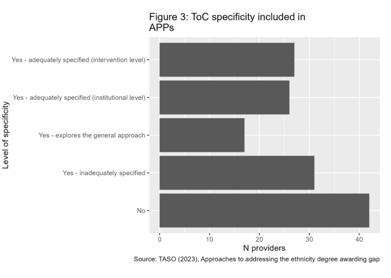
This is not a bad chart. A horizontal bar chart is the right form for this chart to take, it clearly shows the number of providers with each level of ToC specificity, and there is no misleading information.
Step 2: Add brand elements
However, there are some steps that can be taken to make this chart more engaging and distinctive. Firstly, we can apply some brand guidelines, such as the use of brand colours and font:
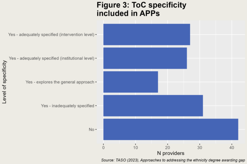
Our guidelines are designed to be used by all, and can be applied using the software of your choice. However, for those who do use R, our guide offers some clearly annotated example code to help you apply your own brand guidelines to your charts.
So far this is an improvement, but it still leaves something to be desired. Here is where we start applying more of the principles in the data visualisation style guide.
Step 3: Declutter the chart
We can think about how we can declutter the chart, such as by removing the redundant Y axis title, axis ticks, and the horizontal gridlines. For this chart, none of these elements are helpful for our interpretation, so we can drop them. We can also make some further tweaks such as aligning the title with the whole plot, rather than the panel, left aligning the caption, and adding a margin around the plot.
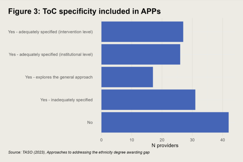
This already looks much tidier, and perhaps even ready to go, particularly for a more formal publication. However, the style guide offers more guidance on how we can elevate this further to make it even more engaging.
This chart gives us all the information we need, but what is the key takeaway? If you are looking at this chart without the accompanying full report, what will you get out of this chart? Is it memorable, or shareable with colleagues?
Step 4: Highlight our key takeaway through an active title and the use of colour
To make this chart more engaging, and to make clear what we think the key takeaway is, we can highlight our point of interest, both through the chart itself and the surrounding text.
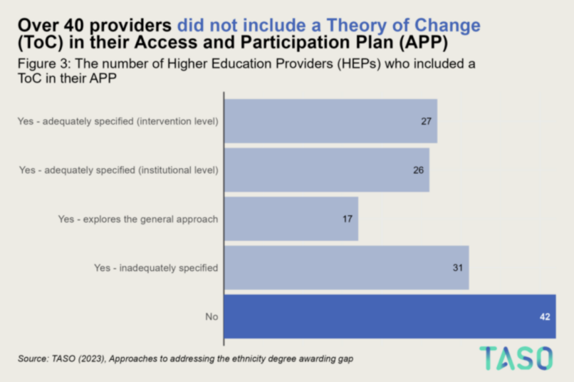
Here, we use an active title, a title that summarises the key takeaway of the chart. We also make a link between the data and the takeaway in the title by using colour. By doing this, we can make it immediately clear to readers what the story we’re trying to tell with this chart is. The chart is easier to interpret, and it can be shared without the accompanying report and still make sense. This chart is more suitable for a presentation sharing your findings, or for a social media post, where people can’t refer back to your main text for more information to help them understand the chart.
Evolution of the chart
Here, we have developed the chart from something that does the job, to something more memorable and engaging, and clearly conveys the key takeaway of the chart.
Empower your own storytelling with data using our style guide, a tool for creating visualisations that leave a lasting impact.
Download the data visualisation style guide
You can also find some example R code for how we create TASO visualisations in our GitHub repository. However, please note that you do not need to use R to create high quality data visualisations. The principles in our style guide can be used to improve the impact of your visualisations using the tool of your choice, be it Excel, Tableau, Python, Flourish, or any other software.
If you have any questions around the guide, or would like the guide in another format, you can get in touch with us at luke.arundel@taso.org.uk.